Target myDevice App Case Study
Employee Curbside Pick Up Experience
As a team, we worked collaboratively to help improve the experience for the Target Team Members.
In a time of Social Distancing, Guest Experience is key and in high demand; for Target Team Members, being able to complete an order for a Guest Pick-Up is crucial, especially when Target receives 200-400 Drive Up Orders per day.
By improving the quality of Target’s Curbside Pick-up and implementing a socially distant Cubby System for guests — this not only helps Target Team Members feel safe but also improves the quality of customer service for Team Members while continuing to give back to the community.
Link
Design Concept
During our in-class breakout session, we discussed our collective desire to work on designing a prototype for an app that is different from the class project prompt of an Expedia competitor or another hotel booking company. As a team, we liked the example of the class prompt’s competitor edge — “COVID related”. With the current state of the global pandemic and subsequent travel restrictions, our team thought it would great to support the lives of millions of people with a digital product that solves an everyday problem; a contactless shopping experience. We started brainstorming potential companies like food delivery services. However, we decided to go in a different direction since many of our cohort’s previous in-class assignments revolved around companies like Door Dash and Uber Eats.
After sharing personal experiences with our own contactless shopping experiences, we decided to move forward with a contactless shopping experience theme. We were able to narrow down our ideal company from food delivery to grocery delivery to a company that would combine both. We started looking at larger retailers that can provide curbside pick up for daily household essentials as well. We decided as a team that Target what be a great company to work on to study and improve their curbside shopping experience.
Roles/Team
Jilene Jackson — Product Owner / UX Designer
Shawn Wydra — UX Designer / Researcher / Accessibility Specialist
Octavia Ashton — UX Designer / Researcher / Content Strategist
Elana Teodoro — UX Designer / Researcher / Content Strategist
As a designer and accessibility specialist, I had the privilege of vocally advocating for a higher standard of design for Target employees in our MVP Target Drive Up prototype. Throughout the project, I urged everyone to think more critically about the users, who they were, and what they’d need to see at-a-glance on this application.
Key decisions made as a UX/UI Designer were:
- scoured the Target website for all typefaces, colors, iconography, etc.
- after user feedback from usability tests and several in-group debates, redid the key/legend for the cubbies so that employees are more quickly and better informed about cubby state
- after learning that Target’s myDevices are android based, I advocated for Material Design System to be a base for our design system
- added the shopper’s profile on the top of most screens so that employees are aware of who they’re shopping for
Key decisions made as an Accessibility Advocate were:
- added patterns to cubbies to make it color-blind friendly
- add uniform spacing rules to create more universality from section to section
The Challenge & Problem Statement
As the world comes to a pause and masks are becoming the new norm, curbside pickup has revolutionized the way society does retail and grocery shopping.
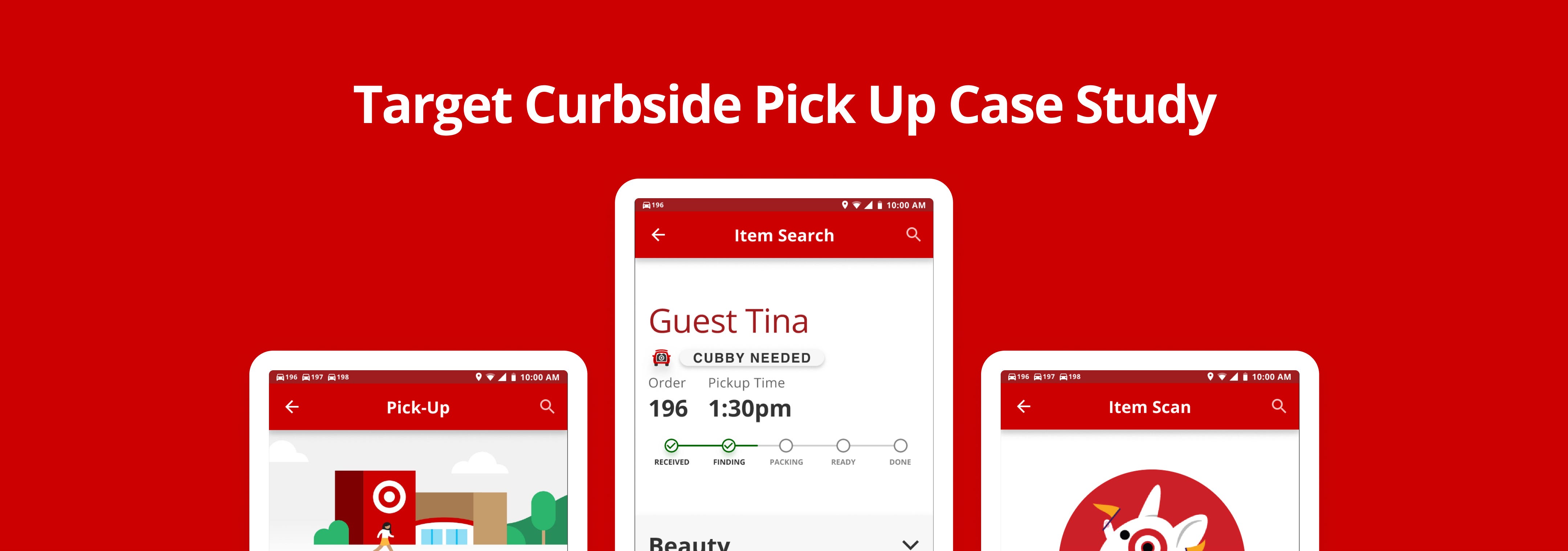
Knowing this, Team IV’s goal for the design is to improve the quality and safety of their Target Team Members. As a Target Team Member, it can be difficult to fulfill a Curbside Pick-up Order when you’re not notified of the Guest’s order status. As a collective, we’ve come up with the Target Tracker to simplify and ease the process of fulfilling orders as employees deal with large volumes of orders throughout the day.
In addition to the Target Tracker, we’ve added a Cubby Feature to separate Guests’ orders along with a Curbside Preference Feature for Guests to select their contactless delivery method to their vehicle to social distance as much as possible during this unconventional time.
How Might We Question
Additionally, we’ve come up with the How Might We Question which states, How might we enhance the ease of fulfilling Drive-Up (curbside pick up) orders for Target employees like Target Travis?
Goals
What does success look like? Identify the key points that the user will use on your product as their achievement. Highlight goals your designs should meet at the end of the project.
Goal 1: Understand the behaviors and needs of TARGET employees who seek to fulfill curbside pick-up orders.
Goal 2: Solve the problem of a labor-intensive workflow for TARGET TRAVIS when fulfilling curbside pick-up orders.
Goal 3: Solve needs for TARGET TRAVIS to be updated in real-time utilizing the Target Tracker.
Research & Analysis
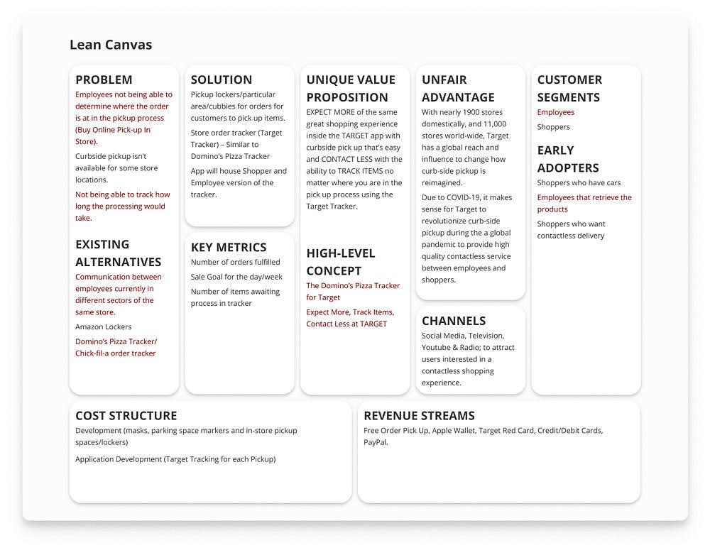
Lean Canvas
Business Problem
Target employees are not able to track in real-time what phase a shopper’s order is in when fulfilling a curbside pickup order.
Solution
Designing the Target Tracker for Target employees to track their fulfillment of Target’s Drive Up orders — modeled after the Domino’s Pizza Tracker
Unique Value Proposition (marketing tagline)
EXPECT MORE of the same great shopping experience inside the TARGET app with curbside pick up that’s easy and CONTACT LESS with the ability to TRACK ITEMS no matter where you are in the pick-up process using the Target Tracker.
User Types/Personas
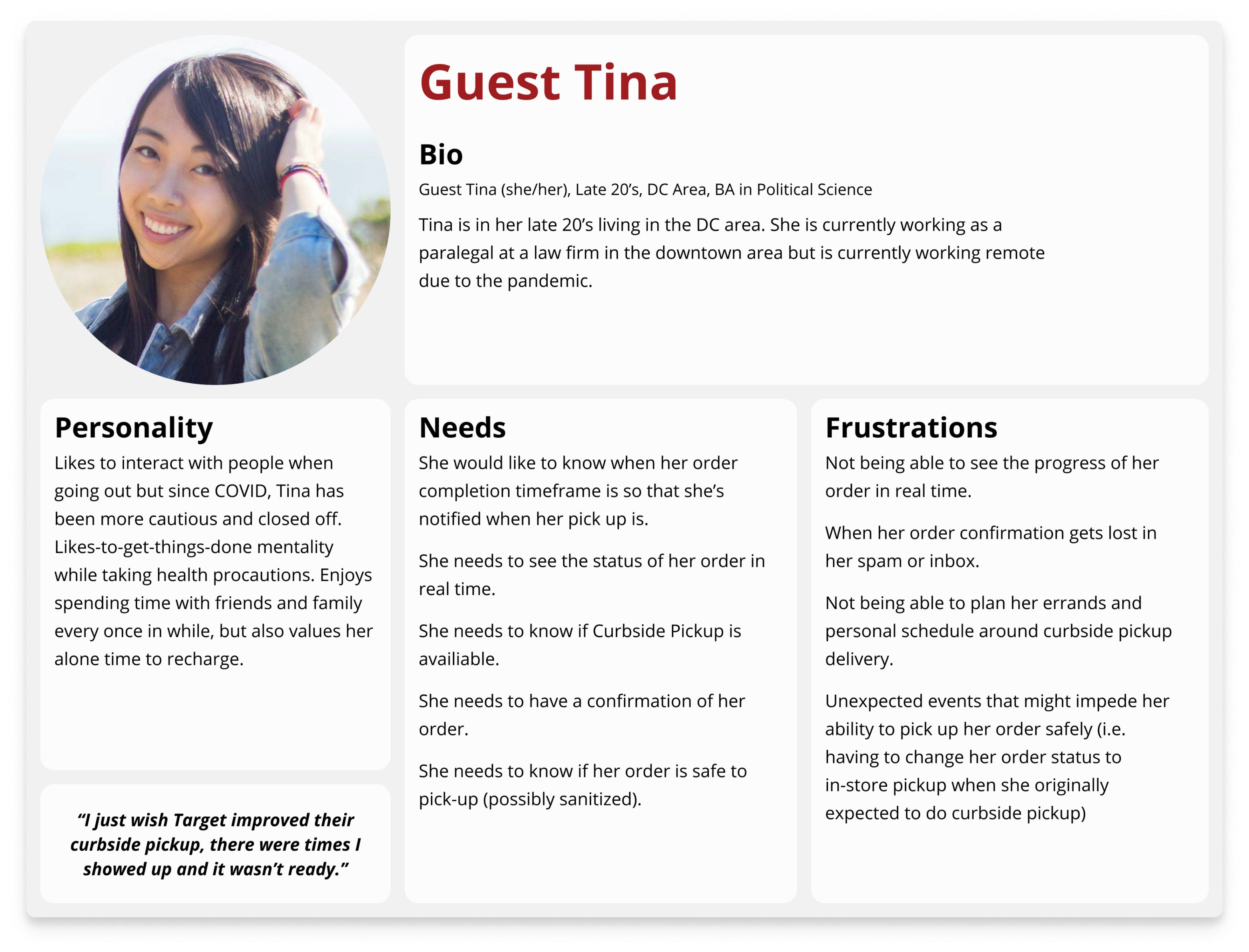
Based on the data that was collected in surveys and the research from our interviews, it helped solidify and refined our proto personas. The proto-personas showcase the Target employee (Target Travis) and Target guest (Guest Tina).

Affinity Map
These six patterns were discovered through an affinity mapping exercise using digital whiteboard MIRO to synthesize data gleaned from user interviews.
- Brands With Best Contactless Shopping Experience
- User’s Curbside Goals
- Curbside Likes
- Curbside Frustrations
- User’s Shopping/Retail Experience During Quarantine
- User’s Wishlist of Curbside Features

Story Map
Synthesized data from the affinity map formed our MVP features validating Target Travis workflow

User Flow

Concepts, Sketching, Wireframes
As a team, our brainstorming methods were crazy 8 and user flow diagrams. Our key goals for the design was to make it user-friendly at first glance, validating the employee’s needs through gratification while keeping the brand loyaty of Target’s signature color scheme.
Below showcases our process sketches of low-fidelity wireframes:

Visual Design & Prototype
The prototype was designed within the Target employee app and website. The goal of the design was to maintain the brand loyalty by preserving Target’s orginal color scheme, iconography, and typography referenced by the Target website.
The Target team uses myDevices through Android’s operating platform. As a team, we maintained Target’s Material Design elements while implimenting additionals to the design system such as the social distant curbside and cubby feature. Once the prototype was discussed and refined, the team presented the design system to a series of users for additional feedback.
Style Guide
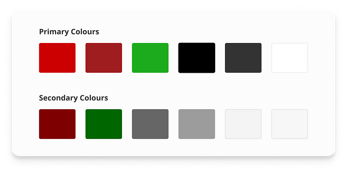
Colors
We utilized the official Target Red as the primary color to make the prototype feel more real. The white and off-white that Target uses as backgrounds was used as backgrounds in the prototype as well, but on top of that it was repurposed for neutral “empty” states for elements such as chips and cubbies. We also use two different greens in a different way that Target uses them. We use the brighter and more saturated green for success or confirmation buttons, and the darker green for success states that are just to notify the employees that something went well, such as snackbars and checkmarks. We repurposed the Target Clearance yellow to be more informative. It’s used for the map’s route throughout the store, as well as a snackbar state to tell the employee they have scanned the wrong item.
Typography
Through our research and looking through Target’s website, it seems they use a proprietary typeface called Targetica — a modified version of Helvetica to suit Target’s needs. Since we could not get our hands on the typeface, we used Open Sans — a Google Font that has similar qualities to Targetica, and if this app is implemented into Target’s employees’ routines, then naturally we can assume that the typeface would be switched out.
We decided to use Open Sans at a low contrasting type scale. It’s a purely utilitarian application. Having a small type scale allows users to have more information to be present on the screen. For accessibility purposes we set the minimum body size to be 18pt. There are notable exceptions throughout the prototype with smaller text sizes, such as captions and overline.

Iconography
To keep with the Material Design System, we utilized Target’s iconography. In denoting the different forms of delivery, (curbside/in-store/same day delivery/etc.), we used Target’s already existing icons to keep the employees and customers on the same page.

Imagery
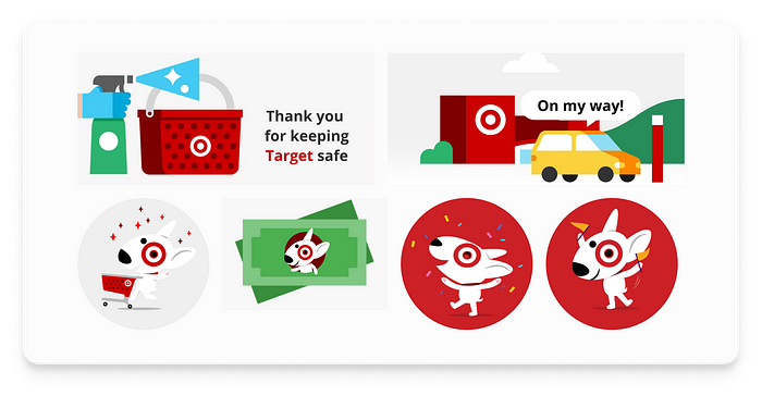
We wanted to motivate the employees by making the application more delightful. To do this we decided to add illustrations, but we also wanted to keep the iconic illustrative style that Target already uses on their website, therefore we went through Target’s site and reused the illustrations.
Elements
Everything began with the Material Design System as a base level of elements. We utilized Target’s pre-existing top and bottom navigation bars, in addition to their radio buttons, and scanners. As with every other project, we needed to create custom components. To add some friendliness to the prototype, most elements have rounded corners (buttons, cubby selections, chips, etc.).

High Fidelity Designs
Utilizing our style guide and the Material Design Systemwas our team designed sections of the Target Travis workflow to create High-Fidelity wireframes that were based on scenes from the team’s Crazy 8’s sketches of Target Travi’s’s curbside fulfillment workflow. The goal of the high-fidelity wireframes is to iterate on the low-fidelity wireflows with more detailed features like color, components unique to our design, transofrmation of the wireframes into a clickable prototype. The Target Tracker feature also received the high fidelity treatment and further tests the idea of a user’s ability to track curbside orders in real time with live clickable actions. The prototype accomplishes a workflow that is less labor-intensive and helps Target Travis fill curbside orders more efficiently.

Test: Validation, Usability, Feedback
During testing, we came across a handful of glitches that needed to be patched and reworked. The most notable changes that needed to be made were that the Tracker needed to be moved elsewhere from being pinned on the top of the screen which cause the Tracker to be unobtrusive to users. As well as, recreating and reworking the cubby’s legend/key so that it’s more comprehensive to the users. Now that we’ve completed our newest iteration, we’d like to re-test the prototype amongst a more focused group, primarily consisting of employees who would be theoretically using this application.
Usability Test Plan

Insight & Revisions
This section highlights consolidated insights and revisions as a team and the feedback that was collected through a series of usability tests from our participants.
- Some Users Expressed “Screens Were Too Long”
Redesigned certain screens by shortening the length and solving the problem of users not scrolling to reveal key information relevant to Guest Tina’s order. - Cut Down ‘Congratulations’ Screens
Reducing the number of instant gratification screens in order to simplify our flow and cut down real-time for the users. - The Beginning Flow Was Redundant
We simplified the sign in flow to offer two user experiences; one with a full login experience and one with a simplified experience that allows a user to begin orders after being prompted from a notification. - Reselected Cubby Colors
Keeping in mind the stoplight method, We changed our colors so users wouldn’t associate certain colors with their own subconscious thinking. We added differentiators on the cubbies and key patterns to accommodate those whom might have disabilities. - Redesigning the Target Tracker
Throughout our Usability Testing, users were missing the Target Tracker up at the top of the flow; so, we’ve moved it down and added animation to each target tracker as it changes phases to call the user’s attention. - Implemented Animations to the Target Tracker
As a team, when faced with users omission of the Target Tracker in its original state, we’ve designed animations as a focal point to the user; this brought up a good point of Accessibility for those with sensitivity to blinking lights that might potentially cause seizures in the workplace.
Next Steps
After our first round of Usability Testing for the Target Prototype, we received feedback by participants and generated iterations to the design system. Here are some beneficial steps moving forward:
Step 1. Kick-off with a second round of Usability Testing; in order to work out any user discrepancies during the first round. The end goal is to test out the iteration of our prototype.
Step 2. As a team, adding and redefining our goals; doing another accessibility check and iteration of the prototype after a second round.
Step 3.Usability Testing round. Presenting our application modifications to Target Executives in the hopes that it will be used by Target Team Members in real-time.
Step 4. We also recommend conversing with a development team to check the feasibility of engineering and coding our MVP prototype system.

